 5.0 out of 5
 Jesse Enkelaar
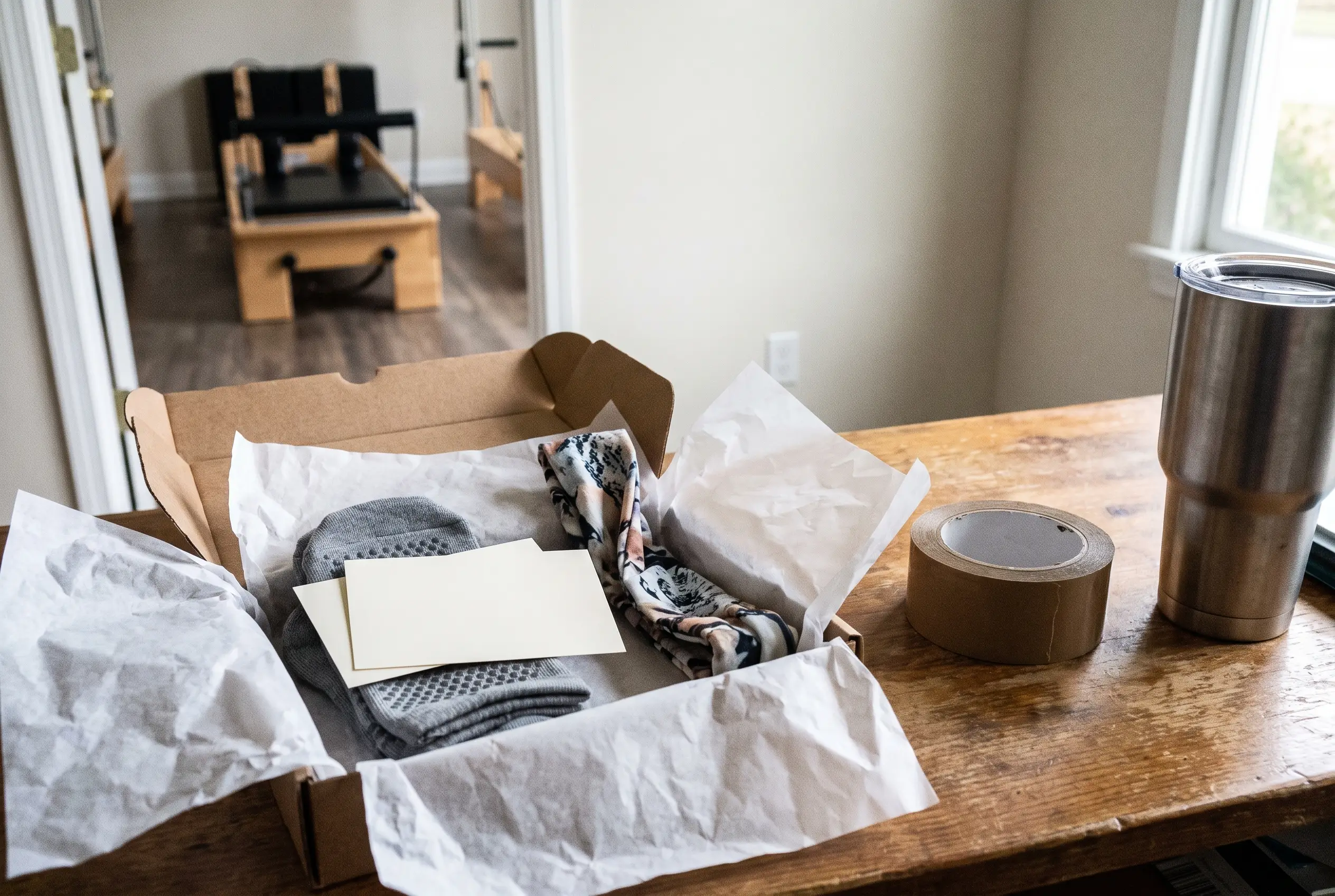
Packaging inserts are the cards, notes, guides, and small extras placed inside an order after the product is packed. They are there to do something useful once the customer opens the parcel: say thank you, explain care, reward the purchase, or point to a clear next step.
The best insert depends on the job you want it to do. If you want repeat orders, a reorder offer or loyalty prompt makes sense. If you want fewer questions, a care card or quick guide is usually the better choice. If you want the unboxing to feel more memorable, a thoughtful note or a small extra can help more than another generic promo.
This guide focuses on the promotional and informational inserts customers see after opening the order, with examples that work for small product brands and studio merchandise such as grip socks, towels, bands, bottles, and other compact accessories where space is limited and every insert needs a purpose.
What good packaging inserts actually do
When people talk about packaging inserts, they sometimes mean anything placed in the box. That can include tissue, padding, dividers, and other materials that protect the product. Those matter, but they are not the focus here. In this article, an insert means something the customer reads, scans, keeps, redeems, or uses after opening the order. It is part communication, part customer experience, and part brand memory.
That matters because inserts get attention in a way email often does not. A customer may ignore a post-purchase email, skim a text, or miss a social ad entirely. A card inside the package is different. It shows up at the exact moment the order is being touched, inspected, and judged. The customer is already engaged. They are looking at the product, forming an opinion about the brand, and deciding whether this felt polished, helpful, and worth repeating.
A good insert can support several outcomes. It can build loyalty with a thank-you note that feels personal instead of automated. It can drive a second purchase with a reorder offer that actually matches what the customer bought, whether that means another pair or related yoga and Pilates accessories. It can reduce confusion with care instructions, usage tips, or support details that answer common questions before they become complaints. It can also encourage reviews or social sharing when the prompt is simple and the path is easy, such as one QR code leading to the right page.
The key is that the insert should help the customer first. If it reads like a spare ad that was stuffed into the box because there was empty space, it usually gets tossed. If it solves a small problem, adds a bit of value, or makes the brand feel more considered, it earns attention. For small orders like grip socks or accessories, that standard is even higher. You do not have room for filler, so each insert should have one clear reason to be there.
Packaging insert ideas worth testing first
You do not need a different insert for every order on day one. Most brands get better results by starting with one or two inserts that each do one job well. For small ecommerce shipments and studio merchandise orders, simple printed cards often carry the load. Physical add-ins only earn their place when they add clear value and do not turn the package into clutter.
| Insert idea | Best for | Good example for small brands or studio merch | What usually works best |
|---|---|---|---|
| Thank-you note | Making the unboxing feel warmer and more memorable | A short thank-you card tucked into a grip sock order with a simple line of appreciation and the brand name clearly shown | A printed card is usually enough. A handwritten touch can work well for small batches, VIP orders, or launch drops. |
| Discount or reorder code | Driving a second purchase | A time-limited code for the next pair of socks or a matching accessory, shown with a clear expiry date and one obvious redemption step | Use a compact card or the back of another insert. It does not need its own separate flyer unless the offer is central. |
| Referral or loyalty card | Encouraging word of mouth and repeat buying | A card that invites the customer to share a friend code or scan a QR link to a simple loyalty page | Printed plus QR works well if the reward is easy to understand. If the rules are complicated, the card will not do much. |
| Review or social QR card | Getting reviews, photos, or social mentions | A small card that says where to leave feedback or share a photo wearing the product, with one QR code going to the right destination | A simple printed card is enough. The link matters more than the design tricks. |
| Care or usage guide | Reducing confusion, support questions, and avoidable returns | A double-sided card showing how to wash grip socks, care for a towel, or get the best first use from an accessory | This is one of the strongest card-based inserts because it gives immediate value and is worth keeping. |
| Product recommendation card | Cross-selling related items | A card that says, “Bought grip socks? Pair them with a reformer towel, bottle, or headband,” using only two or three relevant suggestions | Printed works well when the recommendations match the order. A generic mini catalogue usually feels too broad. |
| Brand story card | Building brand recall and adding context | A brief note explaining the studio aesthetic, community angle, or why the merch line exists | Keep it short. A story card works best when it adds meaning, not when it turns into a full About page. |
| Sample or small freebie | Adding delight or product trial | A small, useful extra that fits the order and feels intentional rather than random | A physical add-in only earns its place when the customer can use it right away and packing still stays simple. |
| Sticker or business card | Leaving a light brand reminder | One well-designed sticker or a neat business card inside a compact order where space is tight | Best used as a bonus, not the main message. On its own, it rarely drives a meaningful next action. |
| Authenticity or limited-edition card | Supporting exclusivity, drops, or collaborations | A card marking a limited run of studio merchandise, a seasonal release, or a collaboration collection | A printed card with stronger stock or finish can make sense here because the point is perceived specialness. |
| Support or return info | Reducing friction after delivery | A short card or QR link that shows where to go for help, exchanges, or order issues without making the customer search | Often best placed on the reverse of another insert so you avoid overloading the package with extra pieces. |
How to pick the right insert for your product and your goal
Choosing the right insert gets easier when you stop treating it like decoration and start treating it like a job to be done. A good insert supports one specific outcome. A weak one tries to do everything at once and ends up being ignored.
-
Start with the main result you want. Do you want a repeat purchase, better onboarding, more referrals, stronger brand recall, or fewer returns? Pick one primary goal first. If your real issue is customers not knowing how to care for the product, a discount code is probably not the first insert to fix that.
-
Look at the first questions customers are likely to have after opening the order. The best insert often answers the question that appears in the first 24 hours. With grip socks, that may be washing, sizing, or when to wear them. With accessories, it may be care, setup, or how the item fits into a routine.
-
Match the insert to the order context, not just the product category or the specific Pilates products in the box. A first-time buyer may need reassurance or guidance. A repeat buyer may respond better to a reorder offer or loyalty reminder. A gift order may need a cleaner, more universal message than a highly specific card meant for people already familiar with the brand.
-
Choose the lightest format that can still do the job well. For compact products, slim cards usually make more sense than bulky extras. If you are shipping one or two pairs of socks, a double-sided printed card is often more effective than multiple loose inserts fighting for space inside a small parcel.
-
Compare cost against likely return before adding anything physical. Printed inserts are cheap to test and easy to swap. Freebies cost more, take up space, and can slow packing. Unless the extra clearly improves the experience or encourages future buying, a well-written card may deliver better value with less complexity.
-
Make the next step specific. “Visit our site” is weak. “Scan here to leave a review,” “Use this code on your next order,” or “See care instructions here” is much clearer. One action almost always beats several. If you ask for a review, a social follow, a referral, and a second purchase on one card, none of them stands out.
-
Check the fit inside the package before you print in volume. The insert should sit neatly, not bend awkwardly, hide the product, or make the unboxing feel crowded. This is especially important for studio merchandise and other compact retail items where presentation matters and the order size may be small.
-
Keep the insert aligned with the rest of the brand experience. If your products are clean, design-led, and studio-focused, the insert should feel the same, especially if you are adding your studio logo to grip socks. That is particularly useful for businesses building a branded retail line across socks and accessories, where consistency helps the whole range feel more intentional.
Design details that make inserts feel worth keeping
Once you know what the insert needs to do, the design should make that purpose obvious fast. Good insert design, especially when you start your design, is not about adding more. It is about making a small amount of space work harder.
-
Give the insert one main job and one clear action. If it is a review card, make the review prompt the hero. If it is a care guide, lead with care. Mixing several competing asks on the same side usually makes the whole piece feel noisy.
-
Make it easy to scan in a few seconds. Use a short headline, clean spacing, readable type, and enough contrast. Most people will glance before they decide whether to keep the insert, so the useful part needs to be visible immediately.
-
Use both sides well. The front can carry the primary message, while the back handles support info, care steps, or a QR code. That is often the simplest way to keep compact orders tidy without sacrificing helpful information.
-
Match the paper, finish, and shape to the message. A premium stock can make a limited-edition card feel more deliberate. Recycled-looking stock can support a lower-waste cue. A handwritten name or short note can add warmth when order volume allows it.
-
Cut anything that the customer will not use, save, share, or redeem. Every line needs a reason to be there. The inserts people keep are usually the ones that either solve a problem, unlock a benefit, or make the brand feel genuinely considered.
Common insert mistakes that quietly hurt results
Many insert problems are small on their own, but together they make the order feel messy, generic, or harder to trust. These are the mistakes that show up most often.
-
Overstuffing the package. Too many cards, promos, and extras make the unboxing feel cluttered fast. When everything is trying to get attention, nothing stands out. Most small orders are better with one strong insert or two tightly related ones.
-
Making the insert entirely about the brand. Customers care most about what helps them right now. A card that only talks about how great the business is will usually be ignored. Lead with value, then layer in the brand message around it.
-
Using vague offers or broken mechanics. If the QR code leads to the wrong page, the discount does not apply, or the wording is unclear, trust drops quickly. Inserts only work when the next step is smooth and exactly what the customer expects.
-
Letting print quality or readability slip. Thin paper, muddy colours, tiny text, or crowded layouts make even a good idea feel cheap. The insert does not need to be expensive, but it should feel intentional and easy to read.
-
Sending the same generic insert with every order. A one-size-fits-all card misses the chance to reflect the product, the buyer, or the order type. Even simple variations, such as changing the message by product line, can make the insert feel much more relevant.